
 Movie posters are due today. Please submit your layered, .psd file into the drop box with a word document describing your steps, and all your source files. Also, print out your poster and participate in the class critique.
Archive for April, 2013
Some students are having sporadic attendance lately. Just wanted to remind you, that after two absences in a row, I can drop you from the class, with a “W.” If you are ill or having challenges, you need to contact me via the blog or email. We can work something out. I’m here to help you. When you miss class, you lose out on your participation grade, and credit for the class presentation. I want you to be successful, so get in touch with me.
Scott Kelby with the National Association of Photoshop Professionals will be traveling to Los Angeles for a one day seminar on shooting professional photos. Included with the price is a detailed workbook, Keyboard shortcut guide, a copy of Photoshop Users Magazine, and a free copy of the software: Perfect Effects 4 (a $99 value), as well as a free 16 x 20 metallic print from mpix (a $20 value). If you register 14 days ahead of the seminar, you will receive $10 off the seminar price of $99.00.
Demo on Building Texture & Special Effects – 4/16 & 4/20 – Golden West
Posted: April 16, 2013 in AnnouncementsThis week we will focus on building texture in Photoshop. Texture adds a lot of interest to your subject, whether it be a movie poster, logo, brochure, or web page. It increases the viewing time of your audience. Remember, we want to keep their attention longer than 3 seconds, which is the norm! 🙂 I challenge you to see what you can come up with before class. The texture duel is on!
Instructor is ill and we will not meet in class today. Please work on your movie posters. If you have any questions, please email me. You can drop any files in the drop box on black board, or email them to me.
Tips for Layout and Design of the Movie Poster
Posted: April 10, 2013 in AnnouncementsTags: Compositing in Photoshop, Montage, Movie Poster
How To Design A Movie Poster – With An Example 13
’08 MAY
In this University project we had to learn how to design a movie poster. We had to consider the role of imaging in a graphic design context and the task involved the conceptualisation, design and production of an original cinematic film poster.
The Brief
In this fictional example our brief was to create a poster for a film that is being re released for a contemporary audience. eg. recreate King Kong for a modern audience in a refreshed manner.
We were given a list of 8 famous movie directors and we could choose any of them to base our poster on. Once we had chosen the director we then had to choose a movie that they had directed and then we had to create a modern day poster for the movie.
We had to use photography as the prominent piece of the design and we could not base the design on existing movie posters.
Research
When you first encounter a brief the first thing you should do is research. I researched the eight directors to find a style and a movie that I wanted to create a poster for.
I ended up coming down to Alfred Hitchcock’s classic movie “Suspicion“. A very short synopsis of this romantic physiological thriller is below.
JOHNNY AYSGARTH IS A HANDSOME PLAYBOY WHO LIVES BY BORRROWING MONEY FROM HIS FRIENDS. HE MEETS AND MARRIES SHY LINA MCLAIDLAW, BUT AFTER THEIR HONEYMOON, THE GIRL FINDS OUT JOHNNY’S TRUE CHARACTER AND BECOMES SUSPICIOUS OF HIS BEHAVIOR. LINA STARTS BELIEVING HER HUSBAND IS A MURDERER AND SHE FEARS THAT SHE COULD BE HIS NEXT VICTIM.
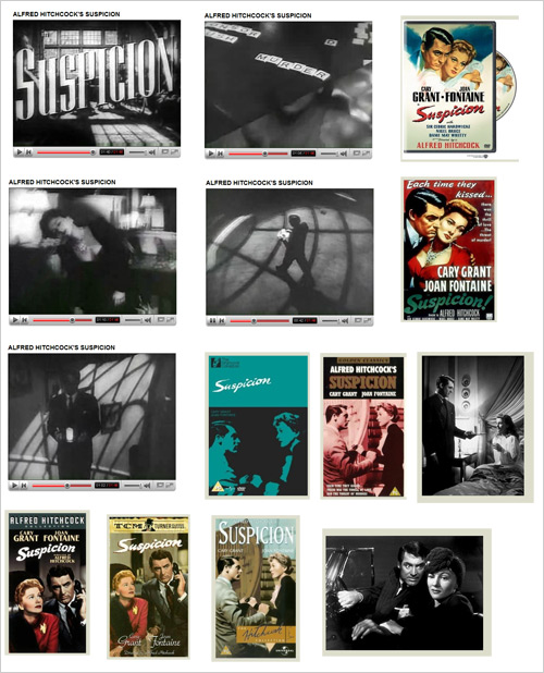
I then researched into the film category which in this case was film noir. I read through the plot on Wikipedia highlighting important facts / figures / items as I went along and I gathered the frames below from the original trailer for the movie on YouTube as well as the original posters released for the movie which I found on imdb. You can see all of this in the image below.
I also researched on what current movie posters looked like today and this site was a huge resource for me. Be careful clicking on the link because it is a big load.
Brainstorming
After a lot of research it was now time to start brainstorming up different concepts and poster designs for the movie. You can see some of my sketches and brainstorming below. Scratch that, not even worth scanning, I didn’t realise how bad they were.
Anyway this is a good time to get creative. I actually have written two articles on how to be creative and how to boost your creativity so you may want to check them out.
Remember the key poster design points that I outlined in this poster design tips post.
A poster should be:
Aesthetic – It should get attention so the message is delivered.
Focused – It should focus and communicate on a single message.
Ordered – The sequence should be well-ordered and obvious.
You should also remember a poster is going to printed in a relatively large format so anything you do should be done using a high resolution. ie. Use a high resolution setting on your camera or scanner when digitising your concepts. A good starting point is at least 150ppi.
You should also consider other factors of the poster design such as the film title, classification, leading cast, distributors, directors, producers etc. The best way to find out what should be on a poster is by looking at other poster designs.
Creation
After you believe you have an idea of where you want to go then this is the time to bring it to life. Go out and take the photos you need, get the material you need and begin creating the poster.
Remember to experiment and play around with your original ideas as you can always improve on your original ideas.
Concept Behind My Poster
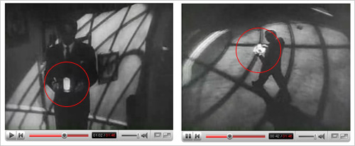
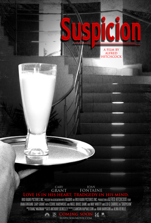
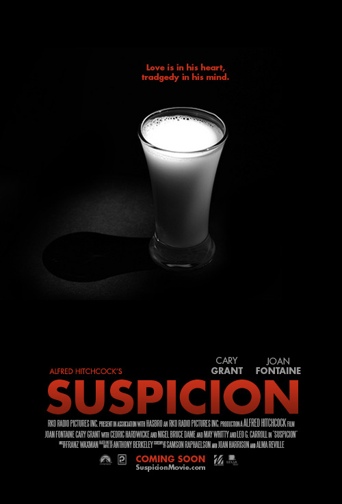
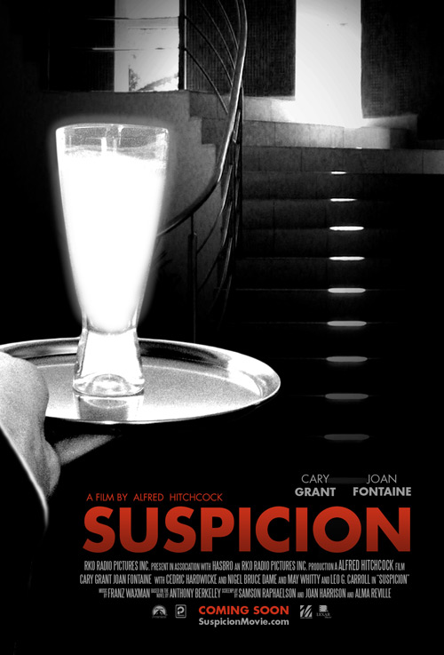
For my poster, the idea I came down to was using the “infamous glowing cup” that was featured in the movie (illuminated by a hidden light to make it seem surreal) as seen above. There is a story behind this cup which I will tell you know…
The movie as you guessed is based around suspicion and Lina, the wife of Johnny gets so suspicious of him that quoted from the plot synopsis “She cannot even stay in the same room at night with him, and when he brings a simple glass of milk to her before bed, Lina is filled with dread. She fears that Johnnie now plots to poison her, and collect the money from her life insurance.” – In simple terms, she is so suspicious she can’t even trust a glass of milk from her husband.
It is actually quite interesting because in the original novel she knows the milk is poisoned (and it was) and she gulps it down knowingly however in the 1941 movie, the milk is left untouched and there is an alternate ending (a car chase) which leaves viewers thinking whether or not Johhny was innocent or not proving how important this glass of milk is to the central theme of the movie.
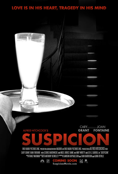
Anyway, after reading about this glowing milk I just had to incorporate it into the poster some how so I focused around this point in my brainstorming and came up with the idea of showing Johnny just about to walk up the stairs to give her the poisoned milk – I wonder what he would be thinking?
I purposely made the glass of milk very white and even gave it a slight glow. I made the actual scene black and white and grainy to depict the original black and white film noir style and to give a mysterious look. The red colour was to used to portray murder which is a constant theme throughout the movie.
Resources Used
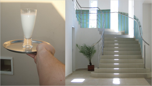
Above you can see the original shots that I used for creation of the poster, one featuring my lovely hand that was flipped for the poster and the other pic, a nice staircase. The rest was up to Photoshop. It was shot with a 7.1mp Olympus 720SW Handycam on the Macro setting. The staircase is actually curling around like in the original 1941 movie which is another small detail that you might have picked up on?
The fonts I used were Blue Highway Condensed for the title, the oh-so-famous movie font (Trajan), for the cast titles and the classic Steeltongs for the condensed type at the bottom.
The edges of the border were done using Photoshop brushes and masking. The movie logos seen at the very bottom of the poster were grabbed from Brands Of The World.
Final Poster
Let’s see how my poster sums up to the tips I mentioned above.
A poster should be Aesthetic – It should get attention so the message is delivered.
The bright contrasting red and unusual white glass figure draws attention into the poster.
A poster should be Focused – It should focus and communicate on a single message.
The black and white style portrays the film noir style of the film as well as portraying a mysterious feel to the poster overall – the image leaves you wondering what is going to happen.
A poster should be Ordered – The sequence should be well-ordered and obvious.
A large heading and a large image draw your eye into the image and there is a clear hierarchy of information. There is a balance between the word suspicion and the glass of milk which makes you think they are related, ie. What is suspicious about the milk? The next thing you would probably read would be either the “A film by Alfred Hitchcock” or the bottom tag line which both are red. The key parts of the poster are all in red which helps help give the reader a hierarchy of information.
And there we have it, that is how to make a movie poster. As always, harsh constructive criticism is welcome, it is due in 2 weeks so I have time to improve things. Oh and the movie is due to release early 2009. (Just kidding, but I wish it was.)
Update: Top 100 Posters of all time. A great resource. I am thinking maybe the Casablanca (#12) font could work for my poster. My favourite is #77 the A.I Cover and #7 just because it is so cheeky.
Revision
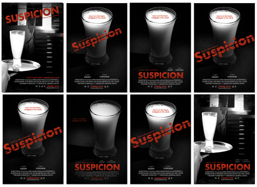
After receiving some great feedback from the comments below, here are some revised versions.
Milk Photo above is All Rights Reserved of OhSillyMonkey.
Below you can see the revisions from the original.
Changed typefaces to Futura.
Darkened the whole poster, removing more of the greyscale.
Moved stairs further up in the poster
Added glow to milk
Moved title to bottom of poster
Added suit sleeve + white shirt onto the arm.
2nd Revision
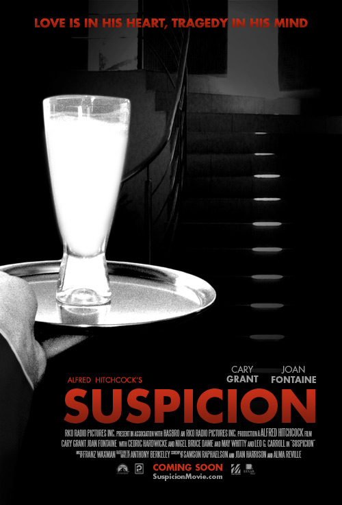
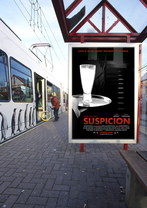
After receiving some more great feedback from the comments below, here are some revised versions and a mock up.
Quick Mock Up
Another Version
Final Poster
What do you think of the revised versions?
Check out these links for some interesting Text Effects:
http://www.hongkiat.com/blog/80-best-photoshop-text-effects-tutorials-part-iii/
http://www.smashingmagazine.com/2009/03/04/50-stunning-photoshop-text-effect-tutorials/
Check out this easy tutorial on a basic Morph in Photoshop:
http://www.antsmagazine.com/photoshop-2/tutorials/morphing-tutorial-using-photoshop/
Here’s another easy Morph effect!:
http://technoclouds.blogspot.com/2012/12/morphing-tutorial-using-photoshop.html#.UVuTyr-RqhQ
There is another example and tutorial on Morphing on the Training page.
Who would have figured that one would do a morph with a light bulb? Well, think again…this is Photoshop! Check out the link below for instructions on how to.
http://www.psd-dude.com/tutorials/resources/light-bulb-creative-photo-manipulations.aspx


